Before & After--Dining Room

It's January and somehow, I suspect this is a very unpopular month for blog posts about dining rooms. I can almost picture the bleary-eyed, design-loving masses, having just caught up on their feeds and re-emerging from the solitude of their cramped, wi-fi enabled attics in the aftermath of the annual magazine/ blog/ Pinterest/ Insta photo deluge of 22 million perfect, bling-laden holiday tables…only to find…a post about a dining room here at the good ol' House Diaries.
Ahem. Rookie blogger sense-of-timing aside, I stumbled across some photos I took a few months ago and thought you might like to see how our dining room turned out. Humour me, will you?
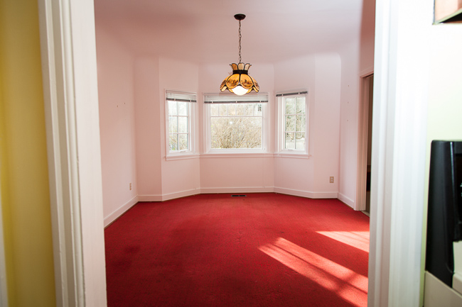
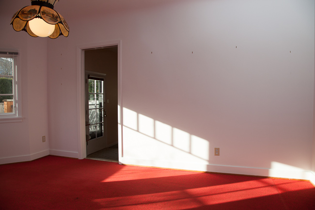
Let's start with a before, from the viewpoint of the living room. Side note: I actually like this shade of pink (do you?) and recently painted Gaby's ceiling a similar colour. More about that later...

After:

I enthusiastically count myself among the many homeowners out there who favour open concept living. More light, a better sense of connection between rooms…what's not to love? In our house, removing most of the wall separating the dining and living areas greatly improved the flow of the main floor. It also remedied the general awkwardness of all the teeny, tiny openings dotting this part of the house, which kind of resembled human-sized mouse holes in the walls.
Before I go on, I should urge anyone who hasn't done this before and is considering tearing down a wall to call in a pro and investigate any structural constraints your house may face. Few things are more annoying than watching some reno show on tv and--with no mention of structure--they cut to a shot of the cute homeowner in an ill-fitting hardhat, giggling away as he or she bashes through an old wall. No! No! No!
The wall above was not without its structural limitations. Since support posts were a must, it only seemed right to make the whole area into a feature instead of a mere engineering necessity. Enter the two pony walls, each topped with walnut (among my favourite woods) and fitted with double-sided bookshelves. They both satisfy my fetish for built-ins and provide a great opportunity to blend creativity with function.
We use these shelves A LOT--particularly Gaby, to whom I've given free reign over the left-hand side. Man, that kid has a lot of stuffies. Here, I'll readily admit I'm not the world's most adept shelf stylist and could use some inspiration now and again. But for better or worse, besides a good cleanup, some flowers (which you'll always find in our house anyway) and removal of our cat's overnight hairballs, my photo prep habits don't typically include stripping away every trace of real life. Where's the fun and mockability in that?
Regardless of whether we make the shelf-styling grade, one thing I solemnly vow to never, EVER do is wrap my books in fake covers so that they "match the room". Does this practice still even assume the status of a "trend"? I hope not. How would you remember which books are which? And why would anyone want to cover up objects that add so much texture and value to our lives?
Okay, movin' on!
Before, from the viewpoint of the hallway/ kitchen:
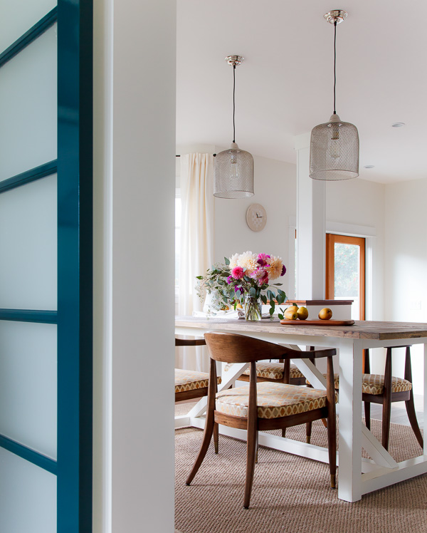
After:
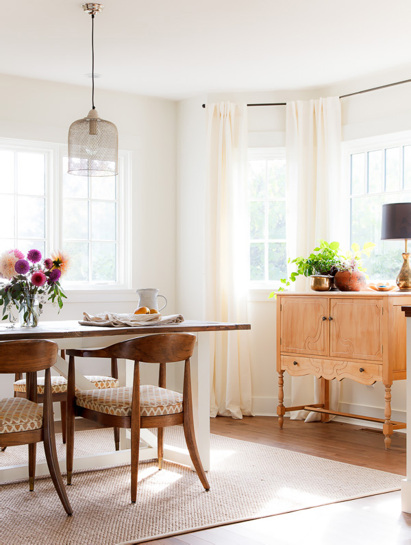
Did you notice the new window on the left? It's beautiful, big and identical in height to the adjacent bay windows. We repurposed it from the bedroom-turned-laundry and love how it captures a view while flooding the dining room with light.
Another significant change was removing and repositioning the bay windows themselves--a choice we extended to most other pre-existing windows in the house. Previously, the vertical placement--almost at the mid-point of the wall--felt so unnaturally low to me. Our contractor dutifully forewarned me about the labour costs associated with such a decision, but in retrospect, I am 100% glad we went ahead and put this on our list of non-negotiables. These are the changes you will never get a chance to re-think once the drywall is up and new stucco is in place, so I consider the added labour cost money well-spent.
Before:
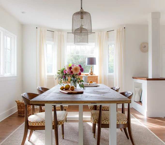
After:

Furnishings and Special Objects
The Table
The large, rustic-style dining table was a new purchase--and a bit of a splurge. We love its weighty presence, which anchors the room and feels in-scale with the equally-weighty chairs.
The Chairs
The oak chairs were a very lucky vintage find at a local consignment shop. I don’t know who designed them, but they are well-constructed and supremely comfortable. I like their heft and the way this is balanced out by their elegantly-curved backs and flared, tapered legs.
The Gallery Wall
I really don’t think art needs to be expensive to have value. It’s far more important that it be personal in some way. With a few exceptions, I also strongly prefer originals over those that are mass-produced or part of a trend. Our little gallery wall is a mix of pieces, including a vintage Georges Braque exhibition poster, a still life acrylic by a talented artist who works at my favourite bookstore, and a white-framed fingerpainting of a flower--Gaby's first piece of pre-school art!
Lighting
In both past and current renos, we've prioritized lighting and consider it a vital element in shaping the mood of a room. We're lucky that our dining room benefits from a tonne of natural light during the day. At night, we rely on a mix of lighting sources. Two mesh pendants in a matte nickel finish hang over the table and have a simple, industrial feel. They are also visually lightweight--you can see right through them!--so as not to impede the view to the outside. Small potlights dot the perimeter of the room to light the gallery wall and fill in shadows. A vintage brass lamp and stair lights leading down to the living room round out the room’s lighting scheme.
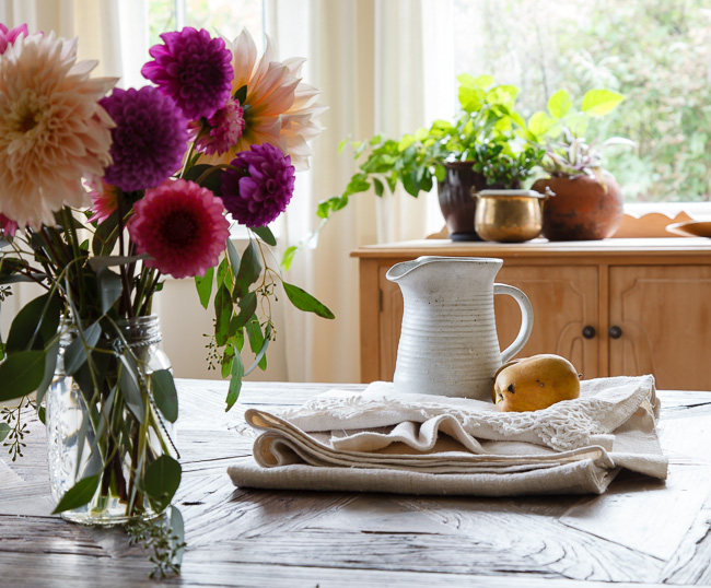
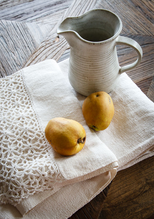
Linens
While I’ve always been a sucker for pretty table linens, the runners below are especially significant to me. During our recent trip to Croatia, I received them as a birthday gift from my lovely aunt, alongside a story of their origin. They are pure linen, with a nubbly, rustic texture. My late grandma grew the flax and wove the cloth herself, while two of my aunts crocheted the intricate edges. The runners are among the few, intact family heirlooms to emerge from my grandma’s farm. I will always find a place in our home to display and treasure them.
The dining room has become one of my favourite rooms in our home. It’s a mix of contrasting elements--old & new, colour & white, curvature & angularity, thrift & splurge--which somehow fit together in a way that reflects who we are.
A few details:
Built-in construction: Darwin Kolodjiezak, Frank Vickery
Table: Restoration Hardware
Pendants: Chintz & Co.
Still-life floral painting: Jessica Whittingham
Chairs, Depression-era sideboard, brass lamp, round mirror: vintage
And a special thanks to my mom, who brought over the awesome organic apples--because taking pictures makes people hungry!