Before & After--The Multipurpose/ Guest Room
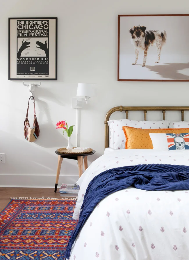
If you just happen to have a penchant for skull pillows and giant portraits of 3-legged dogs, boy have you hit the jackpot today.
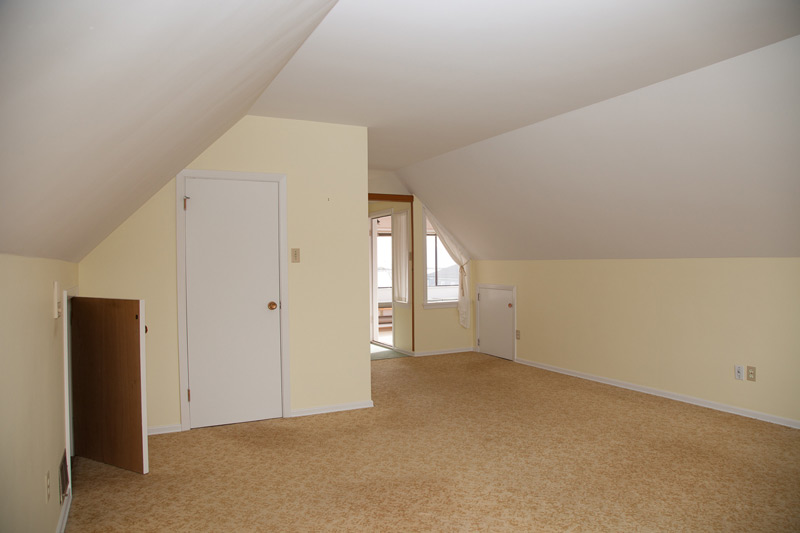
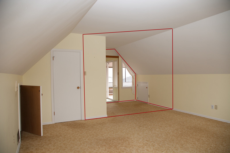
We call this our multipurpose room--a hardworking little space for art, sewing and the occasional guest who drops by. As with most other rooms in our house, this one has humble origins. You could even say that it has no real origins because it didn't exist in the old house. But, oh what sorcery is this? Renovation, I say. You take one large, awkward room, cut it in half, and then you have two much better, far less-awkward rooms. I'm picturing the magician's giant saw trick, with a screaming room in the magician's contraption instead of a screaming woman. Damn, I could really use a funny graphic right now, but it would take me all day in Photoshop, so here is a "before" shot instead. Click the arrow to see how we reworked this space!
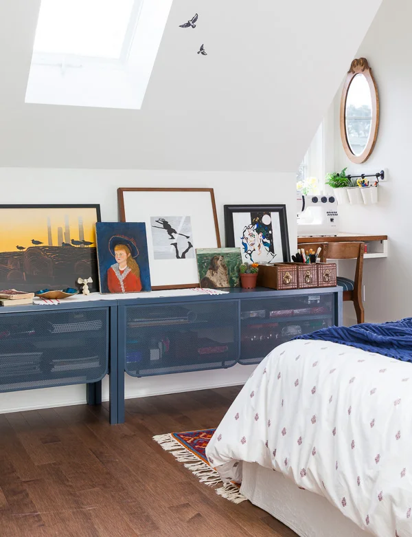
Seems tiny, doesn't it? The main space is actually 9' x 11', which is on the smallish side, especially when you factor in the height constraints of the angled ceiling. BUT! There is a new dormer in the roofline, yielding a full-height bumpout, aka, a nice spot for a built-in desk. A new, opening skylight also creates the illusion of more space and allows the light to shine on in, even on the dreariest of days. Did I mention that it's February on the west coast of Canada? Me and dreary days--we're tight.
I swore off Ikea in this new house. Nothing against Ikea. I just want everything we put in here to not break apart at the point of assembly, which rules out particleboard and melamine--which, in turn, pretty much rules out 90% of Ikea products. However, as soon as you make a rule or swear something off, you really ought to go ahead and break that rule. I mean, why so rigid, right?
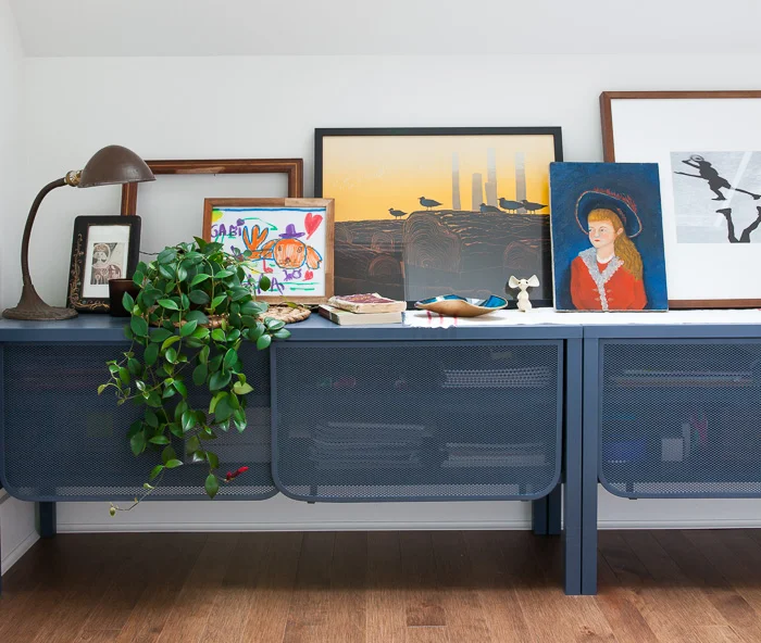
Oh Sweden. You vex me. You still seduce me. And it's adorable how everything you make ends in "orp"--like the two Nittorp units, which fit snugly under the angled ceiling and are a combined 8'--conveniently, the exact length of the angled wall. I also like that they are ultra low. Keeping all the furnishings low in this room helps maintain an open look, in spite of the ambitiousness of working so many functions into a single space. The only thing I wasn't too keen on was the turquoise colour of these metal units. So then, magically, they became smoky blue.
The second orp in this room is the Fintorp rail we installed above the desk. It's marketed as a kitchen product, but no one actually uses Ikea products as-marketed, do they? Hack, hack, hack. I've allocated some of the white hanging buckets to greenery, which, by the way, I'm working diligently to keep alive, per my 2016 projects list.
Oh, and this has absolutely nothing to do with the room in question, but I really do love those jumbo packs of Ikea napkins. Recently, I opened the kitchen drawer and was alarmed to see my jumbo packs reduced to a couple of sad, cellophane wrappers. Out of sheer curiosity, could sending your 5-year old to school with this in her lunchbox qualify as questionable parenting?:
Artwork
You know, I really do love a good mish-mash--and what better way to mish-mash it up than with art? In this room, the artwork is fun and casual by design and includes antique paintings, a vintage poster, a colourful Elton Bennett mid-century serigraph, our daughter's amazing sketches, and a few of my own photos.
Above the bed is a portrait of Nocho, our dog. Unconventional? Hmm, maybe. But here's the thing: art can be anything you love--on trend or not, in a conventional spot or not. So if you want to fill your home with depictions of all the things you love--even (or especially!) if it's the bad-ass little dog who makes you smile every day--then just do it.
Please don't sue me, Nike.
The Nook
Below is the sewing/ art nook in the space provided by the newly-minted dormer. The built-in is made from an old craftsman desk that had seen better days. The wood was stunning though, and a little stripping/ restaining allowed its beautiful figuring to experience new life.
As for sewing, I'm not a sewer by nature. Rather, I reluctantly assumed the role of one when my daughter came home one day and announced that she wanted to be a "vampire dog" for Hallowe'en. Hmmm, not exactly an off-the-shelf costume choice. Since then, I've been learning and, gasp, sort of...liking it!
After pulling off a couple of shoulder bags and totally slaying the zippered pillow cover that had been intimidating me for months, I thought I had this whole sewing thing down pat. Feeling a bit cocky, I thought I could manage an extra-long, decorative bed pillow in fancy orange silk with a little border and contrasting back side, but halfway through that project, all I could think was D-I-Y, why, WHY THE EFF am I doing this when there are skilled professionals out there who are clearly better at sewing than I am??
But I wanted to do it myself, so I tried again and worked really slowly. And now I'm kind of thinking I slayed that one too. Boo-yeah.
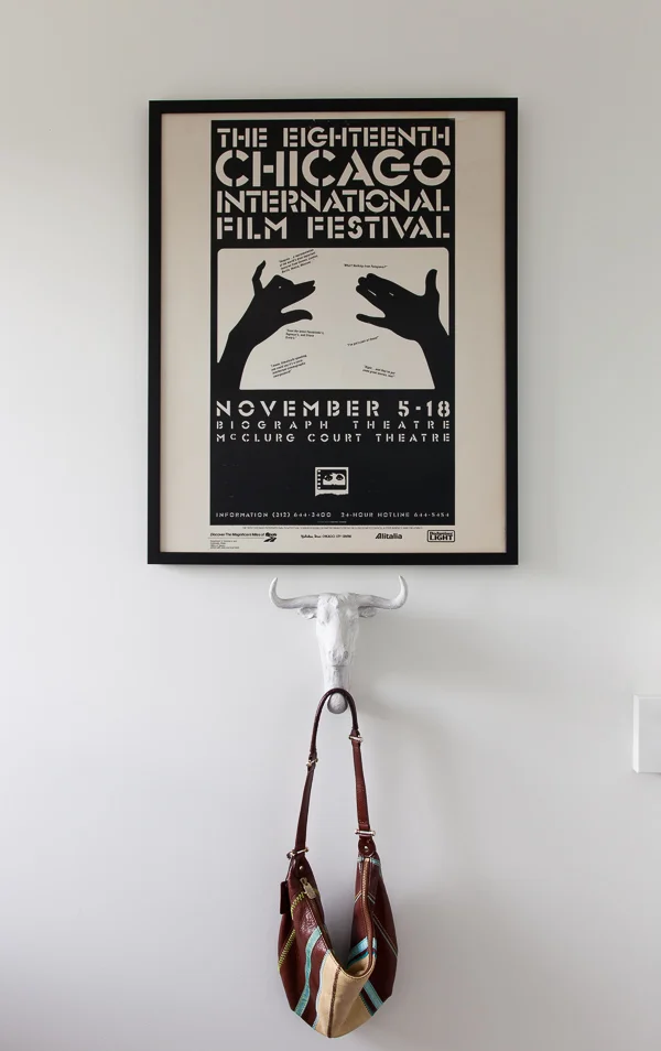
Our girl, Gabi, loves shadow puppets, which made this vintage poster a natural choice. Come to think of it, there seems to be somewhat of a shadow theme going on in this room.
Below: a painting by Ottawa artist, Stephen Frew, and a trio of salvaged Singer sewing machine boxes.
Hope you enjoyed the tour!

