Before & After--Entrance
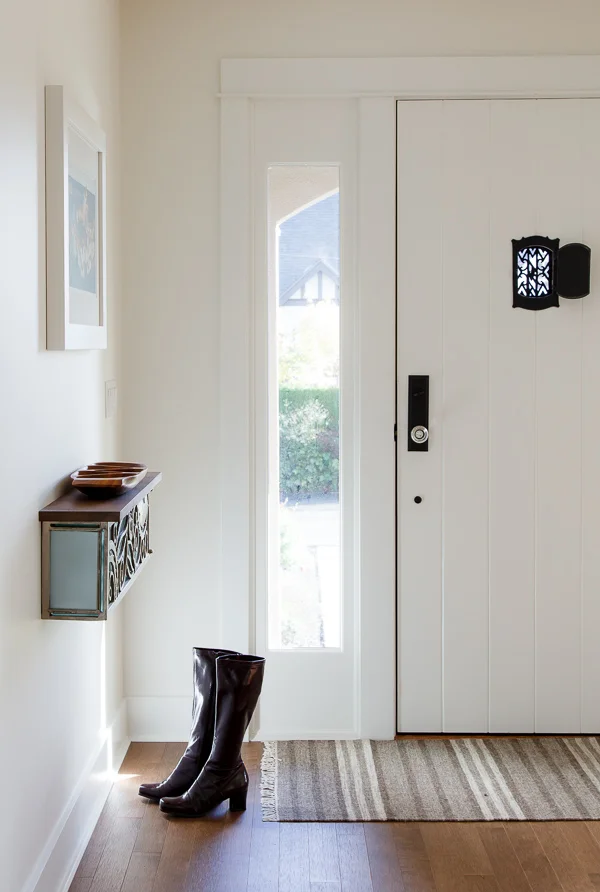
I wasn't planning on pulling out my camera today, but the filtered sunshine pouring into our hallway was just too tempting. Almost as irresistible as a bar of good Swiss chocolate (metaphorically, Roger Federer. I just can't help myself...) It came out of nowhere--the sunshine, not Roger--providing some respite from the morning rain and making our front entrance look, well, rather glowy.
There was a time when this space was more gloomy than glowy:
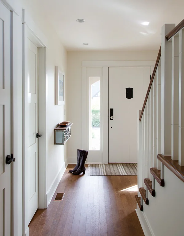
And now:
I liked the cute, old coves, but not the piddly 32" hallway width. Expanding the cramped hallway by 1' as well as opening up and re-pointing the stairwell were, hands-down, among the best things we did in this reno. The result is a main floor that is far less compartmentalized and more in sync with the open feeling we were aiming for in the broader project.
And as for the fate of the amazing old door--7' tall, solid fir, with an original 1930s peek-a-boo window--that decision was easy. We paired it with a new fir sidelight and jamb, while giving the interior side a fresh coat of paint and new hardware. The exterior side took me about a week to strip and re-stain, but it was well-worth the effort. My Maine Coon cat, her gloriously furry self tattoed by stain during a foiled escape attempt, would respectfully disagree.
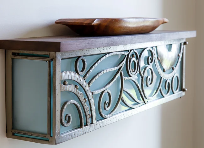
I found this amazing handmade light buried in the clearance corner of a high-end furniture shop. It retailed for $1100, so I was pretty stoked about paying a measly $100. Yee-ha! It was meant to be huge wall sconce, but I had our contractor flip it horizontally and top it with a thick slab of cherry. Now, we have a place to drop our keys and a source of diffused light in the hallway at night.
Sometimes, simple really is best.

